GP website templates
GP website templates
mwong.uk/workspace
© Dr Michael Wong
 Just a picture off the internet
About me
A brief introduction, but you can skip if you want.
What I do
I am the senior partner in my practice and dabble with HTML and javascript in my spare time, authoring the practice and PCN websites by hand.
Whilst I am not a professional web designer, I will take the time to carefully create a rich, usable, and creative website that will have a consistent look and feel throughout. The site will not be filled with cut and pasted content haphazardly slotted into a ready-made website.
It will be authored to modern web browser standards and will be a responsive website. This means that when browsed from a mobile device, the site will feature the same content as a desktop site and will not be a crippled, lower quality or an altogether different version. Given my personality, I will always aim for a pixel perfect site with clean formatting.
Given my clinical role there will be a focus on patient advice, self-referral and education using my existing work and content and with links to official nhs.uk information and self-care and safety-netting advice where possible. Again where possible, I will aim to follow existing NHS England principles on GP websites.
What I don't do
At the risk of doing myself out of business, just a brief note about what I don't do. Given that I am not a professional web designer, I don't provide any content management services via a login account, i.e., a system whereby you update your own site.
I would perform the updates myself and would always aim to make any necessary changes as promptly as possible, sometimes within minutes of the request and aim to fit any new content into the existing site as neatly as possible.
Again on the same front, I do not provide server-side technology, such as automated FFT, mailing lists or online registration.
Finally, one issue, that many web designers seem to experience, is the lack of content provided by the client - ultimately a designer cannot write the entire content of a GP website on their own so it does rely on good information from the client. I am however open to helping create content should it be required.
Further, clinical content that is provided will need to be reviewed regularly, hence why I generally aim to link to NHS.UK official advice but I would be happy to reference any existing content that I have already authored.
Design notes
Just some brief notes on design of the GP website templates, but you can skip if you want.
Responsive design
This means the website will look as intended on all types of devices, from desktop, through to tablet and mobile. For example, this actual website site itself is responsive. To check this, resize the browser window and see what happens.
You can also use responsiveness to show or hide content depending on the mobile device. For instance, you might not want a large or unwieldy image or table appearing on the page if browsed from a mobile device.
Customisable menus
With responsiveness comes adapatable menus. On a desktop, you have more space for links, but on a mobile, the menus will change according to the screen size, but will still give the visitor access to where they want to go. In the template examples, you will see top menus as well as side bar menus, or side menus change to top menus, as in this site.
You can customise any top and side bar links as wished - you should have an idea of the important areas of your site - those pages whose content you wish patients to really know about - you can use such links, which are generally accessible on all devices, to promote those pages.
You can have a mix of navigation in menus, for instance, simple buttons that take you to a page, or dropdown buttons that display a submenu over existing content, or accordion buttons that display a menu whilst keeping existing content. Try it below:
Customisable headers and footers
Both headers and footer content are customisable. Additional links can be added to the header or footer as you require. For instance in the footer, you might want a telephone number showing on all devices, with the addition of the address showing if on a larger device, or simply a copyright message.
Customisable colours
All colour schemes are customisable. However bear in mind that for NHS England compliance, GP websites should have NHS 'look and feel' - this means distinctive blue identity and logo, hence why there is a predominance of blue. However, you can still if you wish have any colours you like.
Customisable buttons and links
Again all button links, text links, from colour, appearance, shape, size are customisable.
Additional links
If is not a problem to have links to required sites, such as social media, online consultation service, prescription ordering services and so on. You can also have a Google Map embeded on the page, for instance, on the contact or find us page.
Modals
NHS England doesn't like modals because it thinks they confuse visitors and that visitors cannot then exit them. I disagree. Modals (overlays) are in widespread use across the internet and across GP websites in particular as an effective means to get urgent messaging across to users. For GP websites they are especially useful given that changes in the GP surgery's situation can have an important clinical impact, for instance, staff sickness or infection outbreak and there needs to be an urgent way of communicating to patients.
Whilst social media can be used for urgent messaging, significantly more people visit the website home page than the surgery's social media page.
Modals allow content to appear without changing the page and without using up too much space for the overlay content on the page. They are good for visual content, like images or video. As irritating they might be, they are hard to avoid and force focus onto the overlay.
Modals can be used where the intention is clear and where there is a clear option to exit the modal.
This is an example of a modal:
A note on forms
Although I can code forms (there is one below on this page), I find that the effort to create the inputs and validation required is somewhat disproportionate to the actual end result and by hand coding it could therefore increase costs for the client. Even on the Ivy Grove website, we use Google Forms - this enables quick and easy customisation, built in validation and with the addition of competitively priced add-ons, email forwarding and other functions can be easily added.
Additional features
I am more than happy to mix and match features from different templates, or indeed develop other features which are not currently shown on the templates, subject to learning and development time, so that you can achieve the design and end result that you want. I am also open to suggestions on any of these existing templates or if you have a certain look you wish to reproduce, please just get in touch with me.
GP website templates
Click on the image or link for a PDF preview. The PDF preview will show prominent fluorescent green tags indicating main features, but a brief features list is also shown below each image:
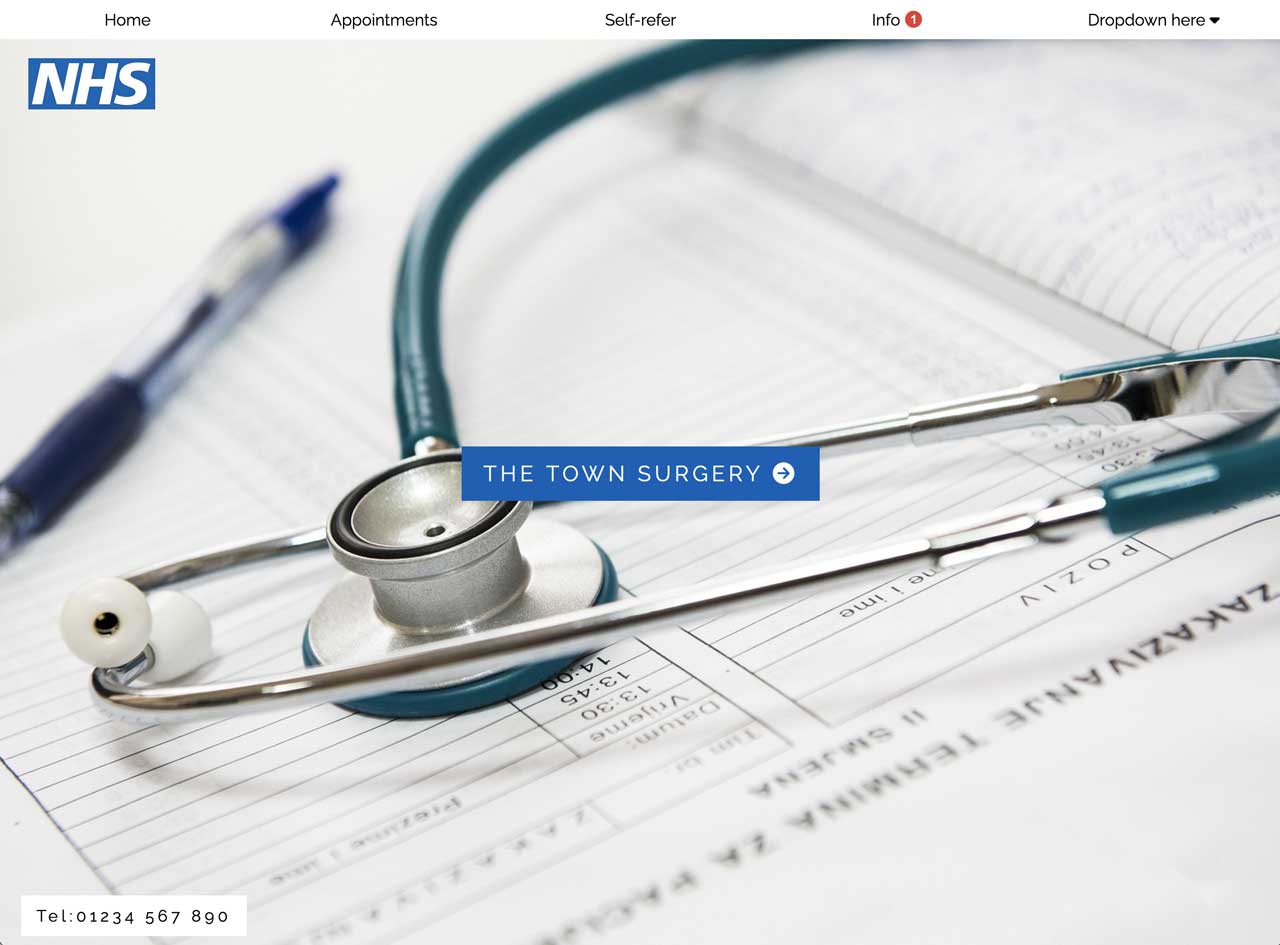
1. Button top template
- Close fitting tabs across top (max number for useability around 4-6
- Dropdown tab at right hand side reveals more links
- Collapses to right-hand side sidebar menu on mobile devices
- Background image on top of page, with enter button
- Collapsible important news section
- Feedback or news section
- Video option
- Modal option
- Emphasis box
- Text, button and icon links
- Option for Google map if wished
- NHS logo top left of front page image
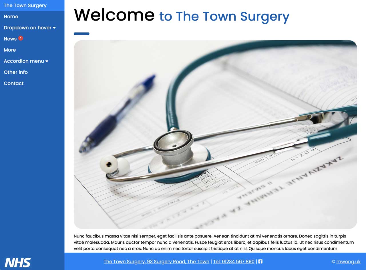
2. Sidebar template
- Left sidebar menu that collapses into left-hand opening sidebar on mobile device
- Sidebar menu can incorporate dropdown menu or accordion menus
- Rounded images and buttons
- Collapsible important news panel
- News section with optional photos
- Video option
- Modal option
- Emphasis box
- Rounded images with text overlay as quick links
- Option for Google map
- NHS logo at foot of sidebar
3. IGS template
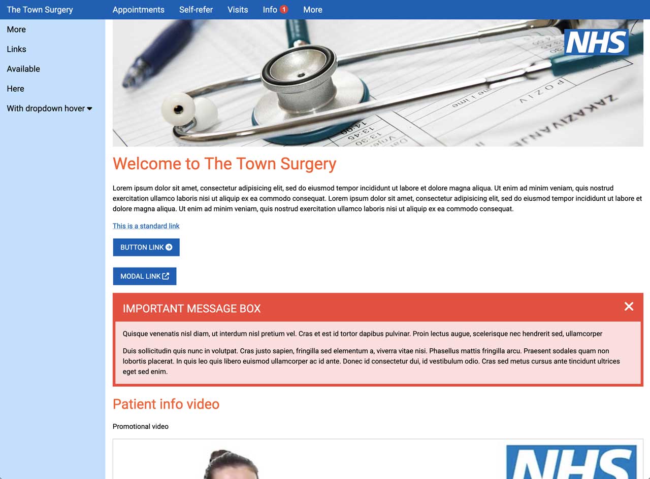
- This is the template upon which Ivy Grove Surgery website is based
- Short banner across top of pagE
- Topbar menu that disappears on smaller devices
- Sidebar menu that collapses into left-hand opening sidebar on mobile device
- Sidebar menu can incorporate dropdown menu or accordion menus
- Square images as links
- Collapsible important news panel
- Modal option
- Video option
- Emphasis box
- Option for Google Map
- NHS logo at top right of banner
4. Link top template
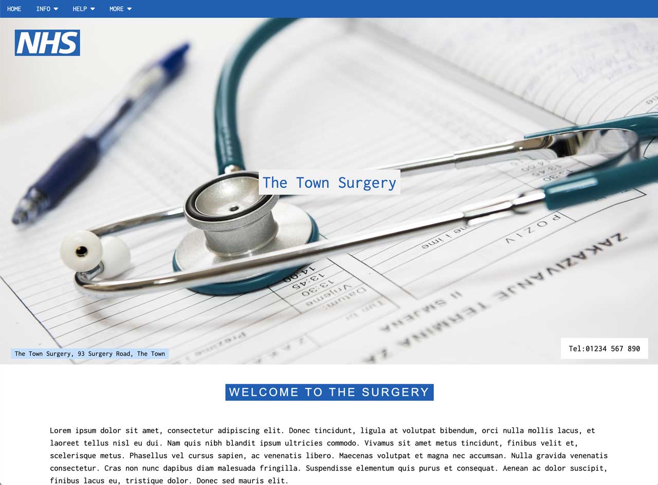
- Topbar menu that persists on smaller devices (max links will be four for accessiblity)
- Large front page image with telephone and address
- Dropdowns for none, one or all links
- News section with photos and/or videos
- Square images as links
- Collapsible important news panel
- Modal option
- Video option
- Emphasis box
- Option for Google Map
- NHS logo top left of image
5. Right menu template
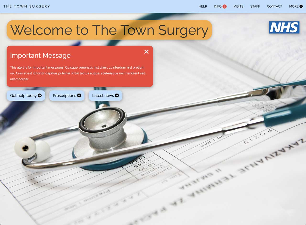
- Topbar menu from right-hand side
- Topbar menu collapses to left opening sidebar
- Large image on front page with quick links and message overlaid
- More button in topbar displays more quick links
- News section with photos
- Collapsible important news panel
- Icon and button links
- Circular masked images can be used as links
- Modal option
- Video option
- Emphasis box
- Option for Google Map
- NHS logo top right of image
6.NHSE template
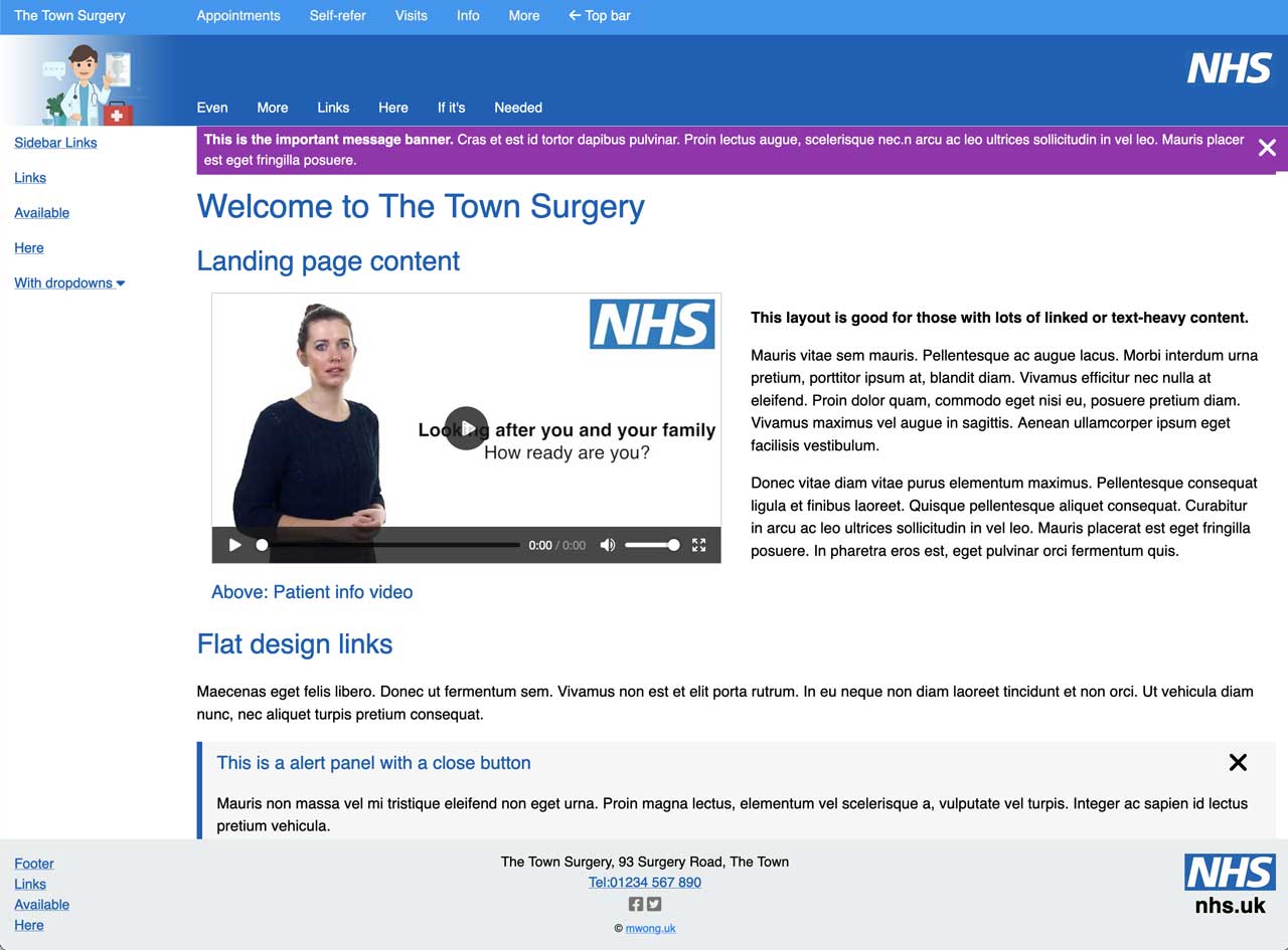
- Flat design
- Text heavy
- Topbar menu
- Sub-topbar with additional links
- Both topbar and sub-topbar menu collapse to sidebar
- Dropdown option in sidebar
- Image logo in sidebar
- Alert banner and panel with close button
- Images links and deascriptive text links
- Modal option
- Video option
- Emphasis box
- Additional footer links
- NHS logo in header and footer
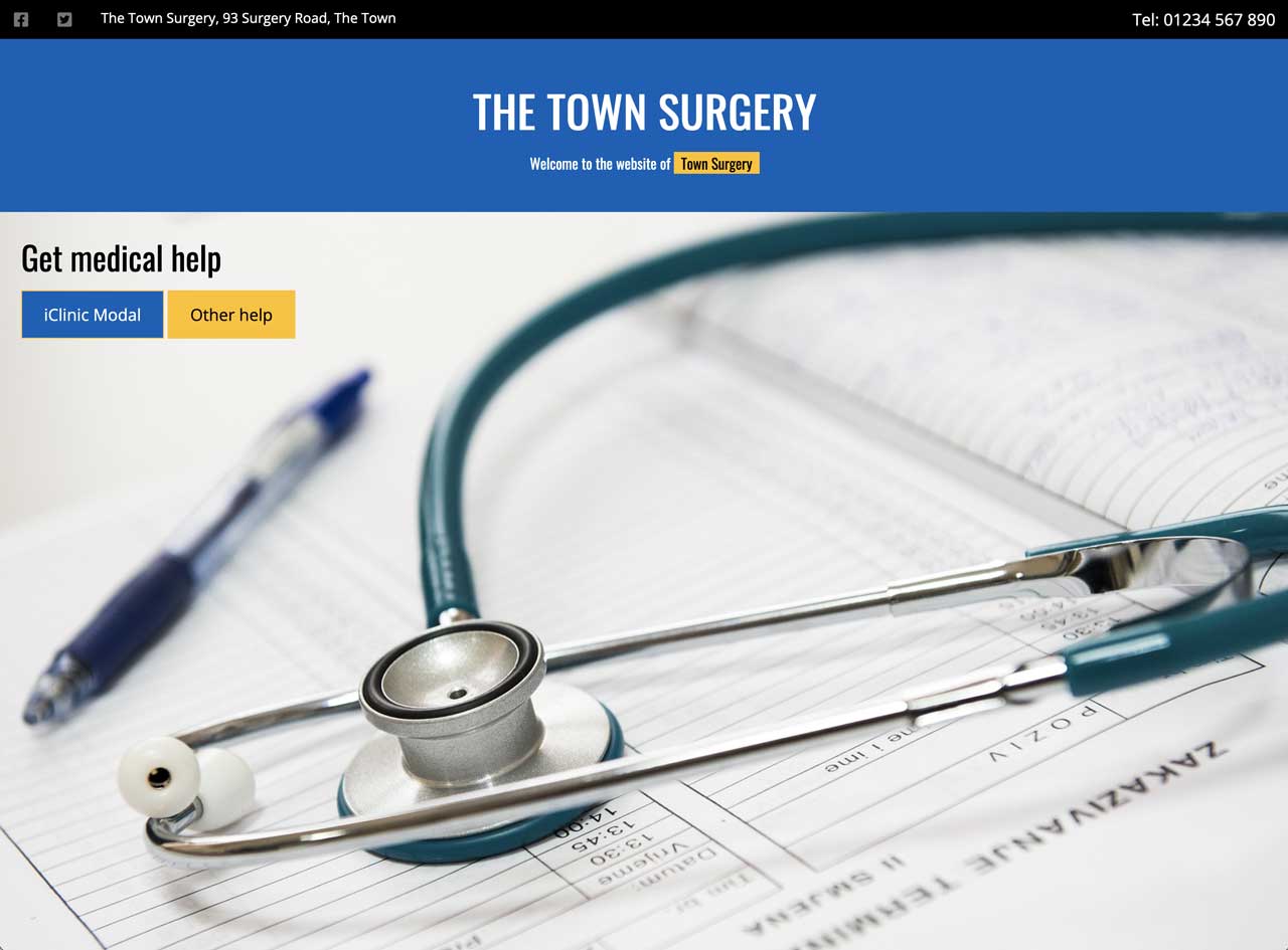
7. Big header template
- Large header
- Top header above with additional links if needed, e.g., telephone number, social media
- Lefthand persistent menu below image
- Dropdown option in lefthand menu
- Content on right hand side
- More buttons to short page and reveal new content
- Topbar social media and address and telephone link
- Overlay to point to link for online consultations
- Quick links
- Modal option
- Video option
- Emphasis box
- Option of Google Map
- NHS logo bottom right of image
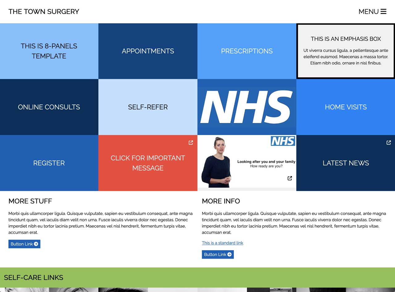
8.Panels template
- Flat design
- Large panels acros screen as buttons/links
- Plenty of other button links available
- Modal overlays for info, links, videos, warnings etc
- Self care links
- Clean flush appearance with no gaps
- Right hand menu
- Option for dropdown in right hand menu
- Panels become 100% wide buttons on mobile
- Video option
- Emphasis box
- Option for Google Map
- EXpanded deep footer for info
- Additional links in subfooter
- NHS logo embedded into one of panels
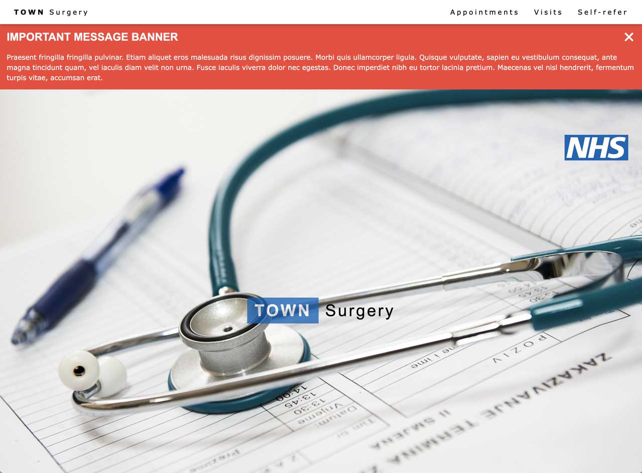
9. Card template
- Important messsge banner across header
- Large image across front page
- Right hand top menu
- Additional responsive menu on baseline of image
- This collapses to become main menu on mobile site
- Card buttons
- Modal option
- Video option
- Emphasis box
- Image card links
- Self-care links
- Option for Google Map
- NHS logo top right of image
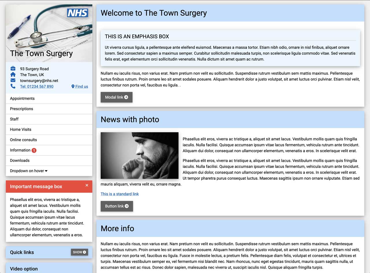
10. Shadow card template
- Shadow card design
- No top bar
- Image at top of left hand column of cards
- Menu in left quarter of page
- Becomes menu for mobile site
- Important message bos
- Modal option
- Video option
- Emphasis box
- Quick links
- Panels become 100% wide buttons on mobile
- NHS logo top right of image on top of left hand column
Contact me
Message received
Error - try again later
Send me a message - all sections are required: